Showing posts with label What A Carve Up!. Show all posts

Wednesday, 20 November 2013

My Chosen Book

After initially leaning towards 'What A Carve Up!', I've decided to design a cover for 'The Outsiders'. I read a lot of each book, but 'The Outsiders' provoked a lot more ideas in my mind. Whilst reading I could not help but jot down a lot of ideas. With 'What A Carve Up' I found it very hard to get into. I was drawn to it at first as I knew it followed similar themes to my favourite book, '1984' by George Orwell - politics - but upon reading it was very difficult to visualise ideas for it. 

'The Outsiders' is a teenage rebellion book that focuses on the separate of people based on their class and social group - the greasers and the socs. There is a lot of violence involved - in particular a use of "switchblades" (essentially flip-knives) and murders and death do take place. The characters are young too - as young as 14 - and I felt a combination of their age and serious subjects like murder and social class could allow me to create an interesting book cover.

Initial Ideas
  • A water fountain. The first "death" and the only murder is featured at a water fountain in a park. I could replace the water of the fountain with blood. This would create quite an interesting but slightly gruesome feel. The red would be very deep and not very discreet - very bright. A typical blood colour. The fountain would be of an old fashioned style, in a park that somehow portrayed the location - America. I could do this through road signs or the buildings that could surround the fountain.
  • Simply featuring a switchblade. Perhaps covered in blood.
  • The outline of a switchblade in a pool of blood.
  • A newspaper article as the front cover, wrapping around the entire book. The newspaper communicates that the story is shocking enough for a newspaper to report it, or suggests that a newspaper is present and relevant to the story. The "main article" on the newspaper would be the title of the book and the authors name, with an image below that relates to the story. Surrounding articles would feature words that give clues to the book - "Murder", "fire", "church", "gangs", "teens".
  • A comparison of Greasers & Socs. E.g. the page is divided by the centre lines of a road, and on either side is an item specific to each group - a mustang on one side, a souped up car on the other.
  • Play on a line in the book "The sun sets on the east side too", when Ponyboy (a Greaser) explains to Cherry (a Soc) that he's just the same as her. A sunset, some silhouettes, similar idea to showing the divide between Socs & Greasers.
  • A fence - a metaphor for the divide between Socs & Greasers.
  • Graffiti, play on the "rebellion" of the teenagers. 

Tuesday, 19 November 2013

Synopsis Of Each Book

The Outsiders
The Outsiders is "the original teenage rebel story" by S.E Hinton. It's based in 1960's America, and follows the relationships and happenings between the two main social groups - 'The Greasers' and 'The Socs' ("socials"). Each group believes they're totally different from each other; The Greasers live in their denim and leather jackets, tight fitting plain coloured t-shirts, chuck-taylors, biker boots, carry knifes, have greasy, combed hair, are relatively poor, live on the east-side, drink far too much Pepsi and "soup up" cars. The Socs are the "rich kids". They live on the west-side, dress smartly, drive mustangs and corsairs, are always getting drunk and trashing houses, and are "cool to the point of not feeling anything". The book follows their rivalry and their initial refusal to admit that they actually have a lot of things in common - "the sun sets on the east side too".
The Socs & The Greasers
The Outsiders Themes
  • Rivalry
  • Violence
  • Hate
  • Class - Rich & Poor
  • Loyalty
  • Injustice
  • Isolation
  • Rebellion
What A Carve Up!
This book follows the greedy and power-hungry Winshaw family in 1980's England. They are incredibly successful but are unaware, and do not care, about the effect their business have on the "everyday man". It is a satirical novel. This means it uses humour, irony, and opinion to humiliate/make fun of something - in this case, politics. As the Winshaw family is so heavily and unexpectedly involved in the British publics life, we follow their developments and how they become increasingly cruel and make decisions that negatively effect the public, as well as the arrival of Margaret Thatcher into parliament. The book is written in the view of 'Michael Owen', who has been hired by Aunt Tabitha Winshaw to write a biography on the family. As well as following the Winshaw's, we follow Michaels life too, and see how it intertwines with the Winshaw's.
What A Carve Up Themes

  • Politics
  • Death - murder
  • Family
  • History
  • Power
  • Sex

Friday, 15 November 2013

Political designs

The book "What A Carve Up!" is a political satirical book, so I started to look at existing designs of the political genre, and how they convey the idea.
Some of these designs are more discreet and clever than the others. Some state the word "Politics" and some emulate it through the imagery. My favourite is the top left, the toothpaste and the tube made to look like the American dollar. It's very clear what it's about, and its easily recognisable as the American dollar. There's also use of the green from the dollar throughout the poster, and no other colours aside from different shades of black/white/grey. This turns the entire poster into something that relates to politics/the country etc, instead of just the subject. "What A Carve Up!" is a book about the power of politics, so if I were to create a book cover for it I would apply a similar idea. Perhaps use imagery that suggested the idea of power - e.g. someone looking down on a group of people, use of the british flag etc.

Aspects of a political design
  • Suggestive imagery - (above: neck noose, fingers pointing to each other)
  • Use of something recognisably political (money, a flag)
  • Colours that represent a political stance.
  • Let the images speak for themselves - is a title necessary? Is an "explanation" of the imagery necessary?
  • Images of things the general population understand and recognise (an army man, big ben etc)
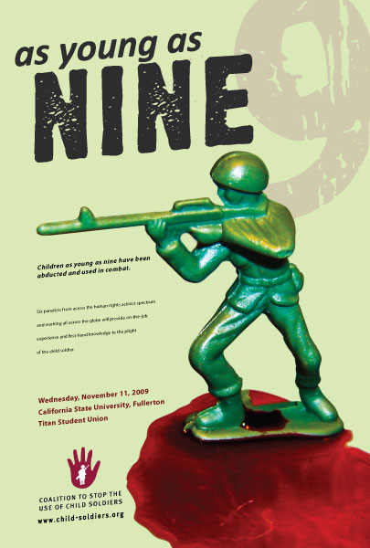
  • Clever use of words - "as young as…" next to a Toy Story army men, to reinforce the word "young".
http://designspiration.net/image/100304577987/
http://designspiration.net/image/918298411985/
http://www.sito.org/id/umc/Pro-3-Comp-Final-1.jpg
http://www.arenabooks.co.uk/content/covers/book-cover-front/the-politics-of-the-rope-front.jpg
http://www.absolutearts.com/portfolio3/t/tarjes/OKey-1173954157.jpg

Thursday, 14 November 2013

1980's Graphic Design: What A Carve Up!

Design created in the 80's or inspired by the era
I looked into existing graphic design from the 1980's, and found the above. This is for me to get more of an idea into the sorts of design from that era, and if I decide to design a cover for "what a carve up!" then this will be useful.

These examples range in the detail and complexity they have. I'm inspired by the "power of Love" and "living on video" examples, specifically their colour. It's very minimalistic, but their relationship between the two is clear as they have similarities. It would be easy and quite interesting to create a series of designs that matched each other, but still were the same. 

Colours from these designs
These colours are very bright and very bold. But there is also a combination of much darker colours to set these against (e.g. as backgrounds) - a deep black, grey. These colours are also very reminiscent of Pop Art, even though the "boom" of pop art was several years earlier in 1960.

But in the next instance, there are examples from the 1980's that aren't as bright or colourful, and where the colours are more toned down and desaturated.
There seems to be a difference between design that was actually designed in the 80's, and designs that are inspired by the general feel of the 80's. The above 2 were actually created in the 80's, whereas a lot of the examples I have chosen above are inspired by - the fashion, the music, the "excitement" (like below).

Image sources

Wednesday, 13 November 2013

What A Carve Up!: Existing Covers and what they tell me

What A Carve Up! by Jonathan Coe is the other book that we have the option of creating a new cover for. 

History of the book & the author
'What A Carve Up!' was written by Jonathan Coe, and is a "satirical" novel. This means that it's written in a way that ridicules a certain topic and tries to convince the reader into changing their opinion of it. Typically, people that write satirical novels put across their own opinions on how the topic their talking about can be improved. link

Around the time Jonathan decided to write another book, the film "What A Carve Up" was rerun. As it was one of his favourite films from when he was younger, he watched it and looked into it further. The film is of the comedy/horror genre, and follows a family that are gathered inside of a old, creepy house during a thunderstorm. They're there for the reading of a will, and whilst its happening a series of mysterious murders start to occur. Coe then decided that as well as just using the title of the film, he could base his book around a family too, and use them as a metaphor for Britain and those in charge of different aspects (e.g. politics, finance, culture etc). This is what his book "What A Carve Up!" or "The Winshaw Legacy" is about. It's based in 1980's Britain under the ruling of the conservative government i.e Margaret Thatcher. 

Example 1
This is the current version of the 'What A Carve Up!' cover. Like the 'The Outsiders' covers I analysed, the authors name is once again bigger than the title of the book.

The imagery that has been featured has a very old/vintage/50's-60's feel, and looks like it's cut out from an old black & white film. The image of the girl looks like she is undressing and she appears to be from and in a wealthy surroundings. Her hair is neatly styled and the bed she is standing over is large and appears carefully crafted out of wood. The sheets look clean and the purple colour of the background, and the general purple tone of the imagery hints towards a royal/wealthy feel - purple has these connotations.

Example 2
This is a cover for the books alternative name 'The Winshaw Legacy'. The main things that give me a clue towards the content of this book are the image of the castle style house, the font that has been chosen for the text and the way the text has been framed - they all suggest the idea of wealth. The castle itself is not something that the everyday, average person will live in and the fact that we can see inside tells us the contents and the people of this castle are significant to the story. If the roof was on and we could not see inside, there would be more clues towards the castle itself being specific (i.e. its "haunted", no one knows what's inside etc). The car parked outside the castle is rather fancy, and further confirms that someone lives inside and we are going to get to know them.

The two fonts chosen for the title of the book are in the hollywood. They both have a sense of wealth, royalty and fame, and remind me of old cinema signs.
To me this also hints towards wealth, and as a whole, power. I'd assume from these signs on the cover that the people that live inside this castle have a lot of power and control. Another assumption I'd make is that they lived in the UK - Castles are more relevant to the UK compared to somewhere like America.