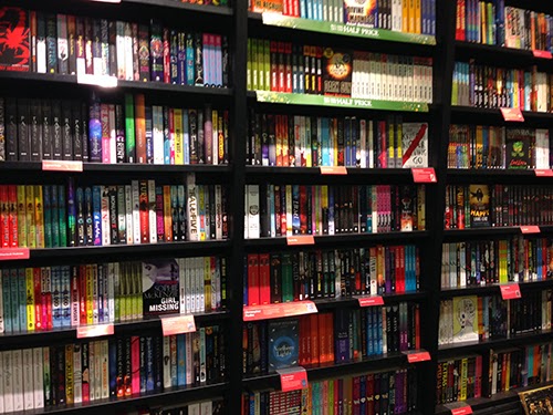
New and popular books are displayed like they're shown in the 2nd and 3rd pictures, and "regular" books are displayed like they are in the first - spine facing out. This means that the spine needs to be just as eye-catching as the cover, enough for someone to pick the book up to actually look at the cover.
Which covers stood out to me?
Looking at the 2nd picture, a lot of the books have very large text on the front that take up the majority of the page. Whether this makes them successful covers or not is a different question. But, they do stand out - in a way that makes them stand alongside and match with the others at the same time.
The cover that stood out to me is in the 3rd picture. "Child 44".
The main thing that I think makes this cover so successful is the colouring. It's very stark and minimal. Red, white and black are colours that all contrast against each other, and the lack of other colours makes the cover rather intriguing. Seeing the cover made me want to find out what the book was about, as it does not appear to give away too many obvious clues about the book. The two main clues are in the title and the only featured imagery - the word "child" and the train tracks in what I assume is snow. Whilst the train track is prominent as it is the only image shown, they are in a silhouette style which refrains from giving us too much detail. This minimalist style results in a successful book cover as it provokes questions as soon as you see it, and you also naturally relate things on the cover to certain meanings - e.g. red = blood? white = snow? death? silhouette = person? child? anonymity? etc.


No comments:
Post a Comment