Tuesday, 12 November 2013

The Outsiders: Existing Covers and what they tell me

To start off my research, I started to look at existing book covers for The Outsiders and analyse why and why not they are successful and what the content of them tell me about the book as someone who has not read it.

The first result I found was someones existing entry for the competition, which did nothing for anyones confidence!
http://www.behance.net/gallery/Puffin-Design-Awards-The-Outsiders-Book-Cover/11775265
Example 1
This first example tells me both a little and a lot about the book. Firstly, the comb that forms the exclamation mark gives a clue towards the type of characters the book has - proud & confident (of themselves and their appearance) - specifically of their hair. The characters, or the main character, obviously has a significant attachment to the comb, so it is perhaps something they're always using or always seen with - is their hair a signature style? An exclamation mark has specific connotations too - surprise, shock, strong feelings, emphasis on a point etc. The fact that the comb forms part of the shape of an exclamation mark tells me the person/s that this comb represents find themselves involved in something that provokes shocked feelings and surprises people. 

The colour orange is associated with energy and adrenaline. It's a less intense version of the colour red, but does not connote danger and negative emotions the way red does. Stereotypically, teenagers are the ones looking for adrenaline and excitement in the form of things that are generally acknowledged as unacceptable or "rebellious", and they are also interested in their appearance and being portrayed as attractive. Research into orange

The colour black starkly contrasts the orange and simulates a 'silhouette' style - this reminds me of how teenagers desire to be just like everybody else - e.g. have the same silhouette. As a summary, this book cover tells me that the book is about teenagers who have found "themselves" so are confident in their fashion sense, overall appearance and each other, and who seek out rebellious activities that shock the people that know them.

Example 2
This example is similar to the first in the way it does not feature a face, so we cannot immediately identify a character in the book. What we do see though, is part of their outfit. The outfit is of a certain style - a leather jacket and white round neck vest/t-shirt - which is significant of the 50's fashion style for teenage boys (e.g 18/19 years old). This tells us the sorts of characters the book is based around and their attitudes. Like I said for example 1, they're proud of their appearance and feel that they look good, so their is a feeling of confidence with a slight air of arrogance. We do not see their face, but we can gather that it is a male and assume that their clothing is what identifies them. Perhaps it's just the 1 person who wears that style of clothing? Or, an entire group can be recognised simply by their jackets and t-shirt - it's their signature style.

1950's teen boy style - what we recognise as that era instantly.
The authors name is larger and positioned in a more noticeable spot than the actual title of the book. It's in a very thin, sans-serif font, though, and the use of the colour red with this means it does not stand out quite as much as the title (which is bold and in white) - there is not enough of the red, because the font is so thin, to make it stand out overwhelmingly.

The title of the book is written in lowercase letters - as just 'the outsiders' - in a very standard, sans-serif font. Viewing this cover now, in 2013, it reminds me of the TV show "the inbetweeners" and how that title is written in lowercase letters too. Whilst "the outsiders" is an older book, I immediately related it to "the inbetweeners" and the general theme of that show - teenagers that don't fit in that try anything to do so. The fact that the book cover features such a basic font reiterates how "normal" and "unnoticed" the teenagers featured in it may be - are they the literal "outsiders"?.

This cover is quite dark. There are no bright colours, and even the use of the red in the text is very discreet and not overpowering. The "brightest" colour is white and that is used for the book title and matches the white t-shirt. The colours hint towards a "graytone" colour scheme and this connotes a feeling of darkness, isolation (reiterated in the literal meaning of "the outsiders"), and slight un-friendliness.

Example 3
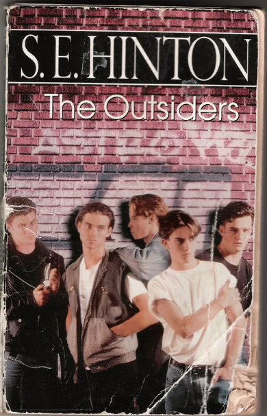
This cover features the most obvious amount of information out of all 3 I have chosen.

The group of 5 boys are wearing typical 50's fashion, so this communicates to us that the book is set in that era. They're positioned against a brick wall which features graffiti. Their positioning against that wall makes us relate them to it and make assumptions - e.g. they're the ones who did it. The boys have confident stances, as if they always stand against that wall - they hand out there? - and their surroundings are normal to them. We associate graffiti with 2 main things: illegal, and gangs and their tags. Their clothing and location gives us clues to their personalities, specifically that they're rebellious and suggests that part of their rebellion is that they're in a gang. 

"S.E HINTON" is written in a style reminiscent of old street name signs.
This tells me more about the boys featured - they hang around the streets, around places they shouldn't and reiterates the idea of them being rebellious. The style of the font used, and the black on white colours are significant to the typical British street sign, although they could be American too. 

Once again, the title of the book is not highlighted in the same obvious way that the authors name is. Here, the title is written just above the graffiti on the wall, and in the same colour too. This further communicates to me that the "outsiders" is the name of a gang or references to a gang, and the positioning and colour slightly simulates the title of the book being part of the graffiti on the wall too.

Summary of the Brief: AF101

Our new assignment is to design a book cover for 1 of 2 books as part of the Penguin Design Award. The Outsiders by S.E Hinton or What A Carve Up! by Jonathan Coe. I've ordered both of these books, and will read them to gain understanding of each and then I'll make a decision on which to pursue.

Outcomes of the assignment:

  • PDF book cover 
  • A2 promotional poster
  • Sketchbook documenting research, preparatory work and progress throughout the project
  • Blog documenting research, preparatory work and progress throughout the project
  • Written statement of 500-1000 words 
  • Branding Guidelines

Restrictions

  • Written statement(double-spaced, Helvetica or Arial, as a word doc/x or PDF)
  • Poster - size A2
  • Book Cover (for entry to Penguin competition) - PDF format, 300dpi, CMYK, 5mm bleed, trim and crop marks included, max file size 5mb. Either colour coated to ISO coated 39 or ISO uncoated 29.

Wednesday, 6 November 2013

Crit Feedback

I presented my work to the class and got feedback on it. The response was very positive and overall my poster was a success. I received a few suggestions on some minor changes that I could make to it.


  • Slightly reduce the intensity of the surrounding silhouettes colours to stop them being too overwhelming for some and to make the dress stand out more. 
  • Spread the coloured silhouettes out further towards the border
  • Swap the colour of the text with the blue and reshuffle the colouring around the edge of the dress to prevent the purple blending in with the blue.
  • Put a border around the white square to make the comic strip effect more obvious.
  • Bigger lower tagline
  • Possibly outline the font
I considered this feedback and made some changes to my work. Mainly I spread out the silhouettes by adding more and increased the font size. Below is the old (left) and new (right)compared.
I've made the decision to disregard the suggested changes, as when I applied them to the design they seemed to over crowd the page and this detracts from my aim to make the poster as simple and easy to understand as possible. I also do not like the size of the text. It looks too squished and less easy to read, and I much prefer it in the original version. 

My decision not to put a border around the white boxes for the text is based on it'll ruin the running theme that I have. The point of those white boxes being there is that they are the same colour as the very main background, and creates 2 effects in 1 - 1 being that a few dots have been removed in order to frame the text and 2 being it lightly simulates the comic-strip effect (where white boxes are put in the corner with text in to describe a scene or have words like "And then…"). I like the effect I've created, and adding a border to them would remove this effect.

I'm very happy with my design the way it is, and feel it is more successful in it's original state. 

Monday, 4 November 2013

My Idea: Developed and Finalised

I've been developing my idea on Illustrator over the half term, and have made some significant decisions that have impacted the strength of the message that's intended and the overall success of the poster. A decision on the font style has been made - a comic strip style - but the specific font that I'm going to be used I'm not sure on. I've chosen one and put it on the design, but I'm going to get feedback from my class on it as I think it may slightly detract from my poster being meant to be aimed at girls.

Here's a brief look at how my idea developed/came together.


Final Piece
The colours
I chose to change the colours as I felt my design was losing the Pop Art feel. Whilst the pink was in blocks and was contrasted by the black on the rest of the page (which is true to Pop Art), I was only using it as it was stereotypical to attract females. I thought about it further and decided to settle with the colours of the rainbow - primary and secondary colours - and have now focused all of the colour into the centre of the page rather than have a bold coloured border. The colours are very slightly transparent - they have a 85% opacity - as I didn't want them to be too strong so that they were too contrasted against the black of the dress and hard to look at.

The background
Tribute to Roy Lichtenstein (a Pop Art artist) and his signature dots. 

The font
This was actually one of the hardest decisions about designing this poster, and was one of the last design choices I made.

I returned back to researching some Pop Art as I wanted to choose something that was both true to the style but still actually fit in with the imagery on my poster. I started to look at Roy Lichtenstein's work again, as I was initially inspired by his work for the background.
Whaam! - Roy Lichtenstein
"Oh Jeff..." - Roy Lichtenstein
I looked at these pieces the most, and noted the comic book style. Sans-serif fonts that are bold and work well with a Stroke effect added. So I started to look at existing comic style fonts. I wanted something bold to feature in the centre of the page and that would mimic the thickness of the silhouettes that surround it - so that the only thing stopping it from blending in would be the colour of it. Below are a few I looked at.
I liked the look of all of them. They're all very similar - bold, sans serif, would suit a stroke effect or would sit well on their own as one bold colour, easily manipulated (e.g. alignment, kerning etc) due to their even shapes. I decided on the following though.
The main reason I chose this font was the way the 'i' is styled - it's lower case, and its obvious. To type in this font you have to type in capitals, but the above is how the letters appear. I liked the look of the random lower case letter. It makes the text look more fun and quirky, and matches the message I am trying to put across about science - it's fun, its popular, everyone enjoys it.