Design created in the 80's or inspired by the era


I looked into existing graphic design from the 1980's, and found the above. This is for me to get more of an idea into the sorts of design from that era, and if I decide to design a cover for "what a carve up!" then this will be useful.
These examples range in the detail and complexity they have. I'm inspired by the "power of Love" and "living on video" examples, specifically their colour. It's very minimalistic, but their relationship between the two is clear as they have similarities. It would be easy and quite interesting to create a series of designs that matched each other, but still were the same.
Colours from these designs
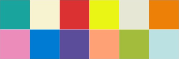
These colours are very bright and very bold. But there is also a combination of much darker colours to set these against (e.g. as backgrounds) - a deep black, grey. These colours are also very reminiscent of Pop Art, even though the "boom" of pop art was several years earlier in 1960.
But in the next instance, there are examples from the 1980's that aren't as bright or colourful, and where the colours are more toned down and desaturated.


There seems to be a difference between design that was actually designed in the 80's, and designs that are inspired by the general feel of the 80's. The above 2 were actually created in the 80's, whereas a lot of the examples I have chosen above are inspired by - the fashion, the music, the "excitement" (like below).


Image sources
No comments:
Post a Comment