


Some of these designs are more discreet and clever than the others. Some state the word "Politics" and some emulate it through the imagery. My favourite is the top left, the toothpaste and the tube made to look like the American dollar. It's very clear what it's about, and its easily recognisable as the American dollar. There's also use of the green from the dollar throughout the poster, and no other colours aside from different shades of black/white/grey. This turns the entire poster into something that relates to politics/the country etc, instead of just the subject. "What A Carve Up!" is a book about the power of politics, so if I were to create a book cover for it I would apply a similar idea. Perhaps use imagery that suggested the idea of power - e.g. someone looking down on a group of people, use of the british flag etc.
Aspects of a political design
- Suggestive imagery - (above: neck noose, fingers pointing to each other)
- Use of something recognisably political (money, a flag)
- Colours that represent a political stance.
- Let the images speak for themselves - is a title necessary? Is an "explanation" of the imagery necessary?
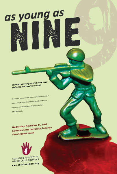
- Images of things the general population understand and recognise (an army man, big ben etc)
- Clever use of words - "as young as…" next to a Toy Story army men, to reinforce the word "young".
http://designspiration.net/image/918298411985/
http://www.sito.org/id/umc/Pro-3-Comp-Final-1.jpg
http://www.arenabooks.co.uk/content/covers/book-cover-front/the-politics-of-the-rope-front.jpg
http://www.arenabooks.co.uk/content/covers/book-cover-front/the-politics-of-the-rope-front.jpg
http://www.absolutearts.com/portfolio3/t/tarjes/OKey-1173954157.jpg
No comments:
Post a Comment